spacestr

🔔 This profile hasn't been claimed yet. If this is your Nostr profile, you can claim it.

Edit
PeopleOfPrint (Unofficial)
Member since: 2026-10-15
PeopleOfPrint (Unofficial)
PeopleOfPrint (Unofficial) 5h

Named by the Community: Foilco Launches Iridium, Its New 3D Effect Foil Foilco has launched Iridium, a new special effect hot stamping foil designed to bring depth, movement and a multidimensional finish to print and packaging. The name was chosen by the creative community itself. The foil is now available to sample. Not all metallic foils are created equal. Where a standard gold or silver finish reflects light in a single, flat plane, Iridium does something different. Foilco’s latest special effect foil shifts and changes as light moves across it, creating a sense of dimension and movement that sits closer to a geological or atmospheric phenomenon than a conventional print finish. The name, it turns out, suits it perfectly. Iridium launched without a name. Rather than decide internally, Foilco opened the naming to its creative community, inviting followers on Instagram, Facebook and LinkedIn to submit suggestions inspired by the foil’s imagery. Over 160 entries arrived. The winning name, Iridium, was submitted by Daisy Kannis, chosen for how naturally it captured the foil’s light-responsive, mineral quality. A name that came from the community, for a product the community will use. The foil is the latest addition to Foilco’s extensive range of special effect finishes and is available in Black, Gold and Silver, across both Graphics and Digital grades. For designers working with hot stamping, it opens up a way of introducing depth and movement that goes beyond what conventional metallics can offer: a finish that responds to its environment rather than simply sitting on the surface of it. Iridium samples are now in stock and available for designers, brands, printers and creatives who want to experience the effect first hand. foilco.co.uk @foilcoltd About Foilco Foilco has been at the centre of the foiling industry since 1987, when David Hornby founded the company in Lowton St Mary’s near Warrington. Now part of Washin, the Japanese hot stamping foil manufacturer, Foilco stocks over 350 foil shades and more than 1,400 products, serving luxury packaging, label makers and the graphic arts community. B Corp certified and ISO 9001 accredited since 1991, the company runs its Workshop educational programme for designers alongside Multiplicity, its touring design event series, and offers complimentary test cards and grade testing with any substrate on the market. https://peopleofprint.com/member/named-by-the-community-foilco-launches-iridium-its-new-3d-effect-foil/ #foilco #effectfoil #iridium #community #gold #silver #daisykannis #davidhornby #rss #feeds #linksharing #qwibbit

#foilco #effectfoil #iridium #community #gold
PeopleOfPrint (Unofficial)
PeopleOfPrint (Unofficial) 6h

Held, Shared and Kept: Weiyun Chen on Print, Identity and Taiwanese Culture New York-based Taiwanese graphic designer and artist Weiyun Chen explores Chinese and Taiwanese culture through print, self-publishing and bilingual typography. Drawing from food, games, packaging, language and everyday visual detail, she makes printed objects that connect personal cultural memory with contemporary design. Weiyun Chen grew up in Taiwan surrounded by objects, images and traditions that felt entirely ordinary. Moving to the United States changed that. Seen from a distance, the familiar became interesting: the visual language of everyday Taiwanese life, its lucky objects and packaging graphics, the texture of bilingual typography, the particular iconography of food and games. Print became the way to bring those observations back into material form. Her practice spans graphic design, publishing, branding, packaging and exhibition design, developed across eight years of living between Taiwan and the US. The independent work runs in parallel: self-publishing projects and printed objects made in collaboration with Lucky Risograph in New York, where risograph printing is the primary process. The technique suits the work. Risograph’s limited colour separations and slightly imperfect registration sit well alongside imagery rooted in the texture of everyday life rather than the precision of digital production. What holds it together is a consistent interest in what print can do that a screen cannot. “I particularly am drawn to making things that can still be held, shared, and kept,” Chen says. The familiarity of the source material is part of the point: objects and references that feel completely ordinary to her can become a way for someone else to discover and connect with a different culture. The printed form is what makes that encounter possible. It gives the work a physical presence that allows it to travel, to be passed on, to sit on a shelf. Weiyun Chen is a People of Print Member. Join the community → chenweiyun.com @tunachen_ https://peopleofprint.com/graphic-design/held-shared-and-kept-weiyun-chen-on-print-identity-and-taiwanese-culture/ #weiyunchen #taiwaneseculture #kept #print #held #risograph #unitedstates #taiwan #lucky #rss #feeds #linksharing #qwibbit

#weiyunchen #taiwaneseculture #kept #print #held
PeopleOfPrint (Unofficial)
PeopleOfPrint (Unofficial) 7h

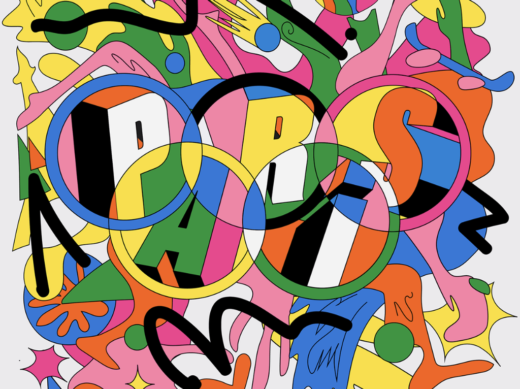
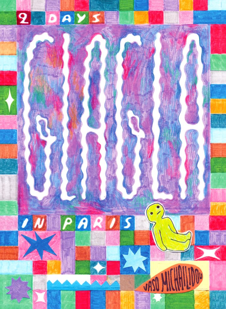
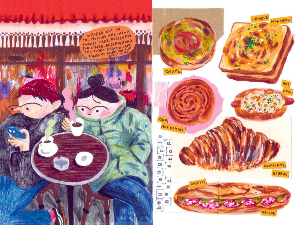
No Stories, No Messages, You’ll See It All When It’s Drawn: Vaso Michailidou’s GLAGLA Greek illustrator Vaso Michailidou documents a 48-hour January trip to Paris in her third hand-drawn travel journal zine, made with markers, coloured pencils and scrap paper collage, combining humour, sarcasm and a preference for getting lost over sightseeing. Vaso Michailidou does not do landmarks without a comic approach. She is not particularly interested in presenting everything as magically ideal. What she prefers is getting lost in the alleys, discovering a nice bar by accident, observing people and noticing silly graffiti. “No stories, no messages, you’ll see it all when it’s drawn,” she says of how she travels now. The zine is the trip. GLAGLA is the third in a series of travel journal zines that began with Tokyo in 2022 and Amsterdam in 2024. This one documents a three-night, two-day visit to Paris in January 2026, capturing what was seen, eaten and experienced in a cold city over a handful of hours. Made entirely with markers, coloured pencils and scrap paper collage, each illustration was drawn from photos taken during the trip, from memory, or from looking up places and combining those pieces into a kind of puzzle. Working on the zine from her return in January until the beginning of April, the drawing process extended the experience well beyond the trip itself. “Documenting it all and turning it into hand-drawn illustrations prolongs the joy of this tiny adventure,” she says. “It makes it a vivid memory to hold for life.” The zine format suits Michailidou’s sensibility precisely. Rather than sharing in real time through social media, the whole experience is held back, reconstructed and shaped into something with a beginning and an end. The reader follows along at the zine’s pace, with humour and sarcasm woven in to keep it honest. The adventure does not need to be perfect to be worth sharing. It just needs to be drawn. Vaso Michailidou is a Greek illustrator, comic artist and graphic designer, currently freelance. She studied illustration in the UK and works across digital and traditional mediums. Website: vasomillo.com Instagram: @squidstew GLAGLA, 2026. Hand-drawn travel journal zine. Markers, coloured pencils, scrap paper collage. Trip: Paris, 23–26 January 2026. https://peopleofprint.com/illustration-2/no-stories-no-messages-youll-see-it-all-when-its-drawn-vaso-michailidous-glagla/ #vasomichailidou #messages #stories #see #glagla #drawn #january #paris #trip #markers #rss #feeds #linksharing #qwibbit
#vasomichailidou #messages #stories #see #glagla
PeopleOfPrint (Unofficial)
PeopleOfPrint (Unofficial) 7d

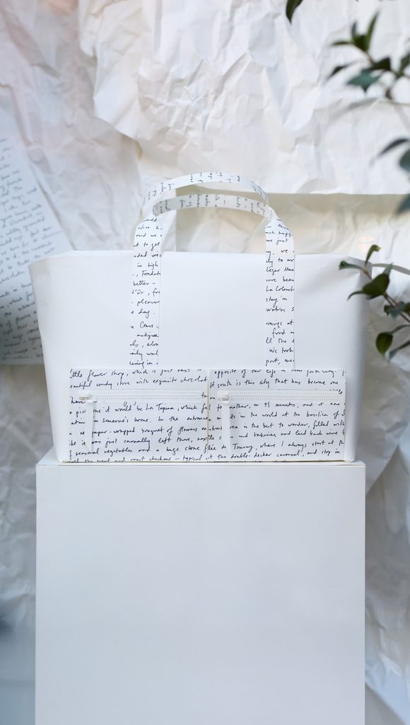
Paper Trails: Nathan Ward Brings MĂ©tier’s Design Process to the Window For Frieze London, luxury accessories brand MĂ©tier commissioned paper artist Nathan Ward to reimagine two of its classic bag silhouettes as life-size sculptures for its Mayfair flagship windows. The installation, created entirely from James Cropper Creates paper, explores the unseen stages of the design process: from initial idea to finished object. Every MĂ©tier bag begins with a paper model. Before leather is cut, a miniature maquette is made: a stage of the design process that rarely leaves the studio. For Frieze London, that hidden process became the centrepiece of the brand’s Mayfair flagship windows, with London-based paper artist Nathan Ward tasked with translating two of MĂ©tier’s classic silhouettes into life-size paper sculptures. The result is a monochromatic installation that evokes the atmosphere of an artist’s studio mid-work. The sculptures sit on white paper plinths, stripped of colour and material so that form and construction read clearly. Woven into the installation are six handwritten travel letters by Yolanda Edwards, founder of YOLO Journal, recounting journeys from Patmos to Nice, Oaxaca and beyond. Her words are patchworked across the paper forms, connecting the making process with the places the bags eventually travel to and the stories they accumulate along the way. Ward brought the full range of his papercrafting techniques to the project, replicating the precision geometry of the bags in a material that shares nothing of leather’s qualities. “Replicating their bags in paper was quite a challenge,” he says. “This is my second time working with the MĂ©tier team, and each time has been such an enjoyable experience.” His previous MĂ©tier installation, based on a summer theme, was shortlisted in two categories at the Creative Retail Awards. The installation was created entirely from 135gsm and 270gsm Coloursource Bright White, made by James Cropper and supplied by Winter & Company. Photography: Shaun James Cox. Nathan Ward is a People of Print Member. Join the community → thisisnathanward.com @thisisnathanward About James Cropper Creates James Cropper Creates is the creative platform of James Cropper, one of the world’s leading specialist paper manufacturers. Through James Cropper Creates, the company supports artists, designers and makers working with paper as a material and medium, commissioning projects, enabling collaborations and documenting the creative possibilities of exceptional paper. jamescropper.com https://peopleofprint.com/member/paper-trails-nathan-ward-brings-metiers-design-process-to-the-window/ #nathanward #bringsmetier #jamescropper #designprocess #croppercreates #papertrails #friezelondon #shaunjames #rss #feeds #linksharing #qwibbit
#nathanward #bringsmetier #jamescropper #designprocess #croppercreates
PeopleOfPrint (Unofficial)
PeopleOfPrint (Unofficial) 9d

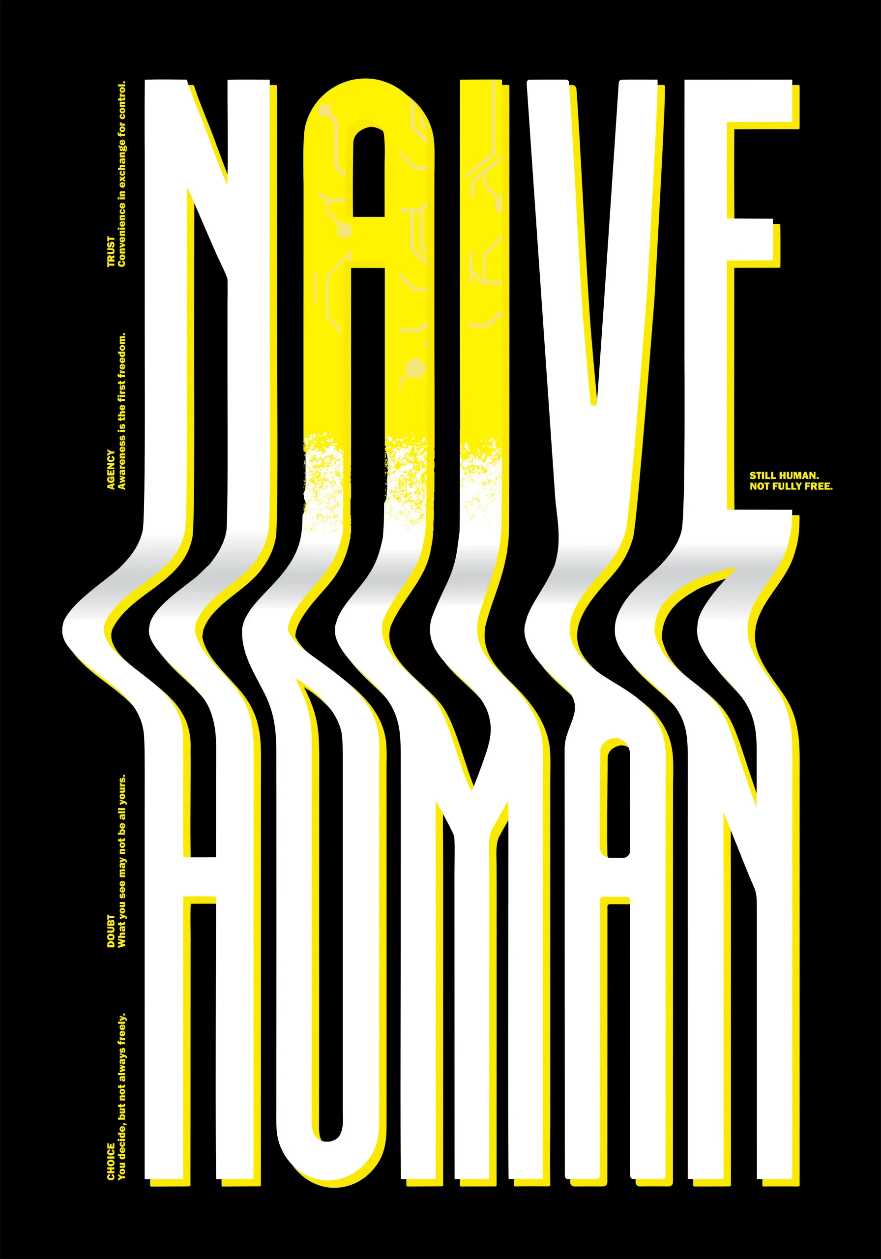
THE 40 WINNING POSTERS OF POSTERHEROES 15 AT GRAPHIC DAYS Vol.11 From 3,718 submissions across 109 countries, an international jury has selected 40 winning posters for Posterheroes 15. The theme is Still Human. The first exhibition take place in Turin during Graphic DaysÂź Vol.11 + award Ceremony on October 24. Posterheroes is a long-running international poster competition and cultural project based in Turin, rooted in the idea that graphic design can be a space for reflection and a tool for social engagement. For its 15th edition, the theme was Still Human: an invitation to consider what it means to hold onto humanity in an era of acceleration, noise and instability. The response was extraordinary. 3,718 posters were submitted from 109 countries, each one a designer’s attempt to answer the same question through image and type. From that global field, an international jury selected 40 winning works. All 40 are considered equal: there is no ranking among them. Aida Hosseinzadeh Aleksandra Budnik The winning designers are Pierpaolo Scrivano, Gianni Rossi, Laura Sarmati, Ardit Coku, Sonja Hamann, Marko Skrbic, Milad Aghazadeh, Yuki Takahashi, Valentina Ospina CĂłrdoba, Sofia Kriklii, Renan Torquato, Xia Hong Ong, Nemanja Dragojlovic, Maria Gilda Perri, Davide Nolfo, Roberta Lonardi, Valentina Pombo Quinteros, Yusuf Gencer, Ivana Jurić, Georgii Ermakov, Soroush Hemat, Josip Mijić, Jialiang Fu, Klimenko Waldemar, Roberta Vottero, Giulia Serafin, Marina Hurford, Aleksandra Budnik, Arman Harutyunyan, Massimo Mosciatti, Paolo IonĂ , Marta MorĂłn Morales, Vesa-Matti Juutilainen, Ricardo ZĂșñiga, Aida Hosseinzadeh, Helena Moreno Marco, Giada Elena Formica, Fergie Valentina GarcĂ­a Hurtado, NaandeyĂ© GarcĂ­a Villegas and Chiara Basile. The full selection is available at posterheroes.org Naandeyé Garcia Villegas Renan Torquato Ricardo Zúñiga Marko Škrbić Nemanja Dragojlovic Marta Morón Morales Paulo Ionà Massimo Mosciatti Max Ong Georgii Ermakov Marina Hurford Jialiang Fu Maria Gilda Perri Lara Sarmati Ivana Jurić Helena Moreno Marco Giulia Serafin Fergie García Ardit çoku Davide Nolfo Chiara Basile Arman Harutyunyan Award Ceremony and First Exhibition On Saturday 24 October at 2:00 PM, the 40 winning posters will be exhibited together for the first time at Cantieri Gruppo Building, Via A. Banfo 43, Turin. The occasion is the Posterheroes 15 Award Ceremony, taking place as part of Graphic DaysÂź 2026 under this year’s festival theme, Disorder. The ceremony is the moment when the winning posters move from screen to wall. It is also when the Special Mentions and additional awards will be revealed for the first time. The projects selected by partners for cash prizes, as well as in-kind awards from media and creative partners, remain undisclosed until the event. The exhibition sits within a broader context. During Graphic DaysÂź 2026, the contemporary works of Posterheroes 15 will enter into dialogue with a selection of posters and objects from the Olivetti collection, made available by the Associazione Archivio Storico Olivetti. The encounter brings together different visual languages and sensibilities across time, united by the capacity of graphic design to go beyond communication and become a cultural tool and an interpreter of change. The event is free to attend. Registration is available on Eventbrite. Register: Award Ceremony — Eventbrite View the full selection: posterheroes.org Discover the festival: https://www.graphicdays.it/2026/torino/ Posterheroes is an Associate Partner of People of Print. Posterheroes 15 — Still Human. Award Ceremony and First Exhibition: 24 October 2026, 2:00 PM, Cantieri Gruppo Building, Turin. Part of Graphic DaysÂź 2026. https://peopleofprint.com/features/the-40-winning-posters-of-posterheroes-15-at-graphic-days-vol-11/ #graphicdays #winningposters #posterheroes #stillhuman #awardceremony #helenamoreno #massimomosciatti #nemanjadragojlovic #gildaperri #mariagilda #rss #feeds #linksharing #qwibbit

#graphicdays #winningposters #posterheroes #stillhuman #awardceremony
PeopleOfPrint (Unofficial)
PeopleOfPrint (Unofficial) 9d

Saturated to the Edge: Carl Cozier in the HahnemĂŒhle Fine Art Showcase Bristol artist Carl Cozier, who works under the name Holy Moly, makes work that refuses to stay in one lane. Illustration, murals, typography, wearable pattern: all of it pushed through the same high-energy, saturated graphic sensibility. His work is part of People of Print’s open call exhibition in partnership with HahnemĂŒhle, opening at Department Store & Co in Derby on 15 October 2026. Carl Cozier grew up in a small town in Oxfordshire and came to illustration through fine art and graphic design, switching tracks later in his career. Bristol sharpened something. The city’s attitude, as he describes it, is infectious, and it shows in work that leans into colour with conviction: saturated, pattern-driven, kinetic. Under the name Holy Moly he has built a practice that moves between surreal worlds, dynamic type and large-scale murals, picking up commissions from Boomtown Festival, Penguin Books, Adobe and The Guardian along the way. He has been selling prints for around seven years, working in giclĂ©e, screen print and hybrid editions through his own Shopify store. Over the last couple of years prints have become a more deliberate business focus. Organic reach dropped, as it did for most artists, and Cozier responded by taking a more structured commercial approach: using paid advertising to compensate for the loss, accepting the higher overheads as a cost of sustaining the sales. It is a pragmatic read of where print sales have landed, and he is not alone in it. For day-to-day work he does not regularly use HahnemĂŒhle papers, but when an edition needs to hold up he turns to Photo Rag or German Etching, both available through Bicep Express in Bristol. “If I need a piece to look extra special I will opt for the HahnemĂŒhle Photo Rag or the German Etching,” he says. The appeal is direct: “my bright colour palette seems to sing on these papers.” Museum-grade stock, colour longevity and the tactile quality of the surface are what he values. Extra special editions, done properly. Carl Cozier is a People of Print Member. Join the community → holymolyuk.co.uk @holymolyuk HahnemĂŒhle Fine Art Showcase, in partnership with People of Print. Department Store & Co, 55 Sadler Gate, Derby DE1 3NQ. Opening 15 October 2026. https://peopleofprint.com/illustration-2/saturated-to-the-edge-carl-cozier-in-the-hahnemuhle-fine-art-showcase/ #carlcozier #artshowcase #fineart #hahnemuhlefine #holymoly #edge #print #saturated #germanetching #photorag #rss #feeds #linksharing #qwibbit
#carlcozier #artshowcase #fineart #hahnemuhlefine #holymoly
PeopleOfPrint (Unofficial)
PeopleOfPrint (Unofficial) 14d

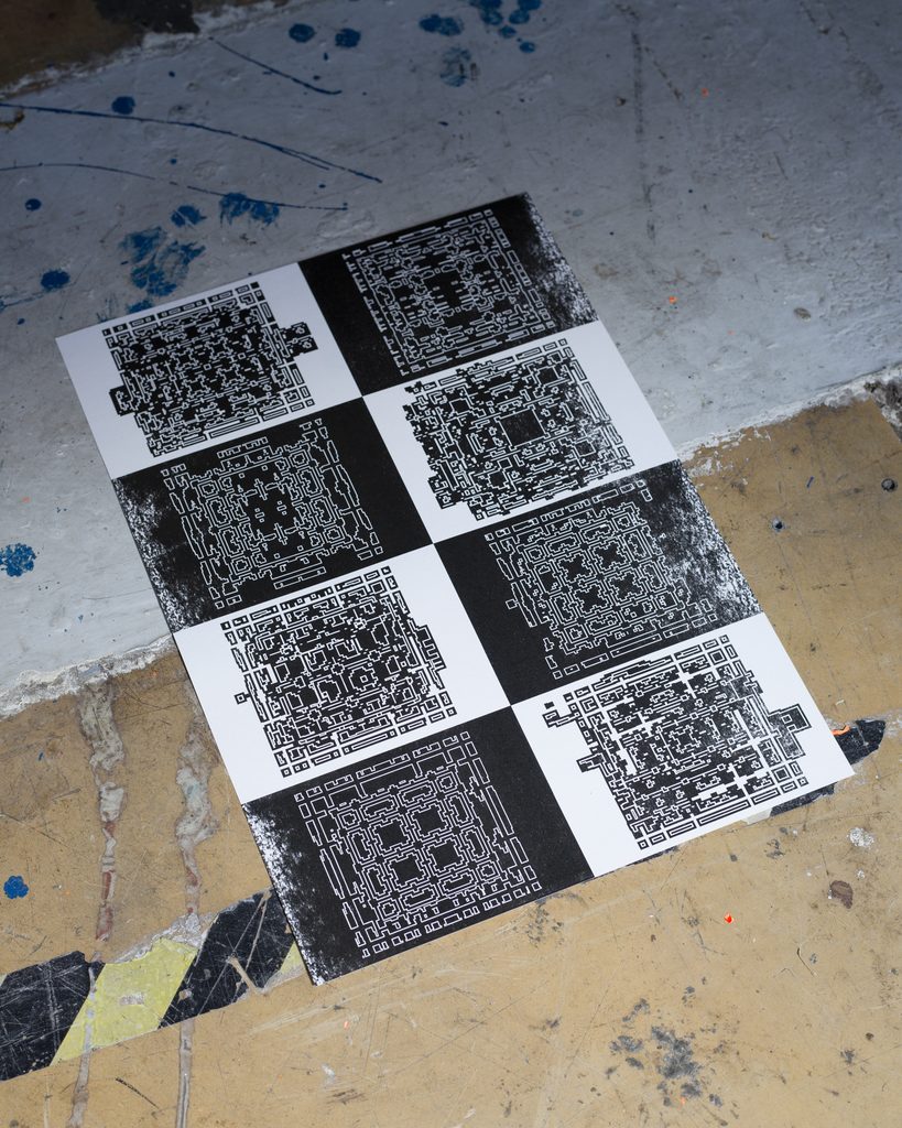
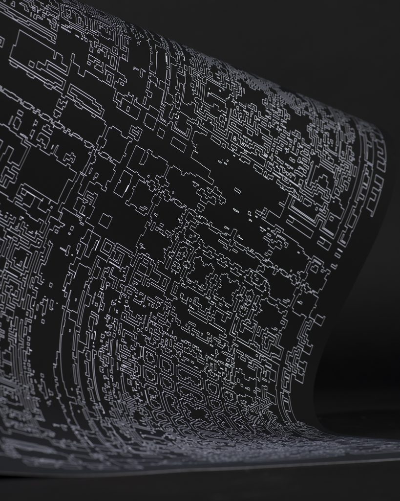
Order From Pattern, Disorder From Chance: Sun Möller-Park’s Ready, Set, Fuse – Pt. 2 Developed as a master’s project at the Bauhaus-UniversitĂ€t Weimar, Sun Möller-Park’s second phase of Ready, Set, Fuse takes the geometric vocabulary of Korean dancheong decoration and pushes it into deliberate disorder. Printed in Risograph, the series tests what happens when a strict grid gives way. Sun Möller-Park’s starting point was the dancheong tradition: the system of decorative painting applied to Korean wooden architecture, characterised by highly structured geometric ornament and a formal colour language developed over centuries. Within that tradition, the geummun pattern: interlocking diamond and geometric shapes that tile with mathematical precision, became the framework for the first phase of Ready, Set, Fuse. The second phase keeps the same vocabulary and breaks the rules it established. “Ready, Set, Fuse – Pt. 2 is the second phase of my master’s project,” Möller-Park explains. “While the first phase focused on simplifying Korean dancheong patterns — specifically geummun geometric shapes — into a grid-based Riso printing framework using repetition, mirroring and interlocking, this second phase introduces disorder and chance into that system.” The shift from order to controlled disruption is the conceptual core of the series. The grid that made the first phase coherent becomes, in the second, something to destabilise: the same forms, the same logic of repetition and interlocking, now subjected to interventions that introduce misregistration, overlap and the particular unpredictability of Risograph printing as a collaborative material process. Risograph suits that process well. The printer’s slight mechanical inconsistencies and the way its ink layers interact across the spot colours Möller-Park works with mean that chance is already built into the medium. The project directs that tendency rather than suppressing it. The work was developed at the Bauhaus-UniversitĂ€t Weimar under the supervision of Professor Markus Weisbeck and Julia Albrecht. “I was drawn to geummun patterns because of their strong geometric structure and the way they balance individual units into a larger whole,” Möller-Park says. “Translating that into Riso meant thinking carefully about how layers of colour interact — where they reinforce each other, and where they start to break down.” The prints are the work of Möller-Park with assistance from Boramee Kim. Sun Möller-Park is a graphic designer based in Jena, Germany. studiomoepa.com @studiomoepa Ready, Set, Fuse – Pt. 2, 2026. Risograph prints. Sun Möller-Park with assistance from Boramee Kim. Master’s project, Bauhaus-UniversitĂ€t Weimar, supervised by Professor Markus Weisbeck and Julia Albrecht. Images: Sun Möller-Park. https://peopleofprint.com/risograph/order-from-pattern-disorder-from-chance-sun-moller-parks-ready-set-fuse-pt-2/

PeopleOfPrint (Unofficial)
PeopleOfPrint (Unofficial) 14d

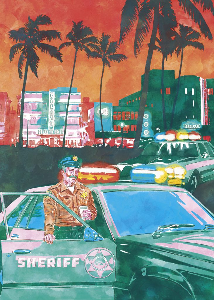
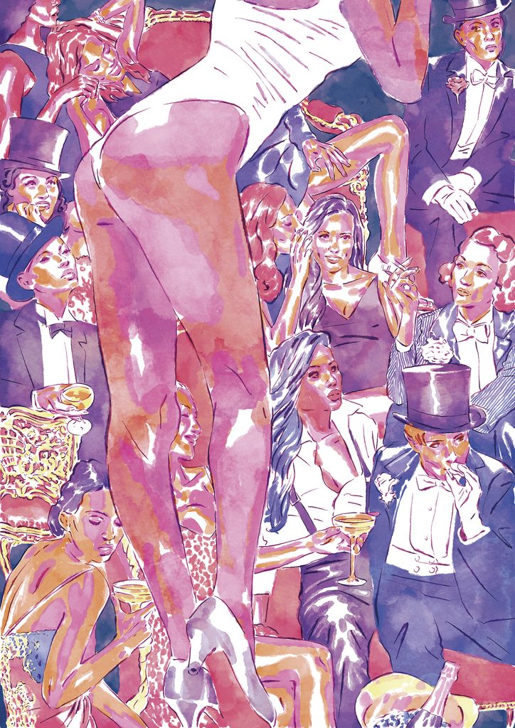
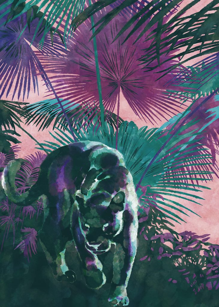
Where Reality and Imagination Begin to Mix: Pauli Salmi’s At the Hour of Dusk Helsinki-based illustrator and graphic designer Pauli Salmi creates a series of night-time digital paintings that explore how familiar places feel different in darkness, moving between social moments and quieter, more instinctive scenes in the hours just before morning. There is a particular quality to the hour before sunrise: familiar places become uncertain, light and atmosphere are in the process of shifting, and the line between what is real and what is imagined begins to soften. Pauli Salmi’s series At the Hour of Dusk is built entirely in that in-between space. The works were created as digital paintings in Procreate across 2025 and 2026, each beginning from a simple idea or mood and developing through layering, adjusting and repainting without a fixed plan. “I start with a feeling rather than a composition,” Salmi says. “That openness lets unexpected things appear. The images end up holding more than I originally intended.” The series moves from social moments, a festive show in the night, figures in urban scenes, to quieter and more instinctive ones: a jungle cat moving through shadows, ruins under stars, a lone figure over city lights. Mood, colour and atmosphere are the constants; fixed narrative is deliberately withheld, allowing each image to stand alone while remaining part of the larger whole. The inspiration draws from night-time environments, urban scenes and cinematic imagery, particularly the visual register of those pre-dawn moments when the world has not yet resumed its ordinary logic. Familiar places feel quieter, more open to interpretation, more available to the imagination. “I’m drawn to the feeling that something is about to happen,” Salmi says, “but you can’t tell yet whether it will be ordinary or extraordinary. That uncertainty is the atmosphere I’m trying to hold.” Pauli Salmi is a Helsinki-based illustrator and graphic designer specialising in painterly digital illustration. His work combines strong colour, atmosphere and narrative ambiguity across editorial, book and brand contexts. Instagram: @pauli_salmi_illustrations At the Hour of Dusk, 2025 to 2026. Digital paintings, Procreate. Works include: Crepuscular lights and shadows (2025), Festive show in the night (2025), Jungle cat sneaking in the shadows (2025), Ruins under the stars (2025), Figure over city lights (2026). https://peopleofprint.com/illustration-2/where-reality-and-imagination-begin-to-mix-pauli-salmis-at-the-hour-of-dusk/

PeopleOfPrint (Unofficial)
PeopleOfPrint (Unofficial) 14d

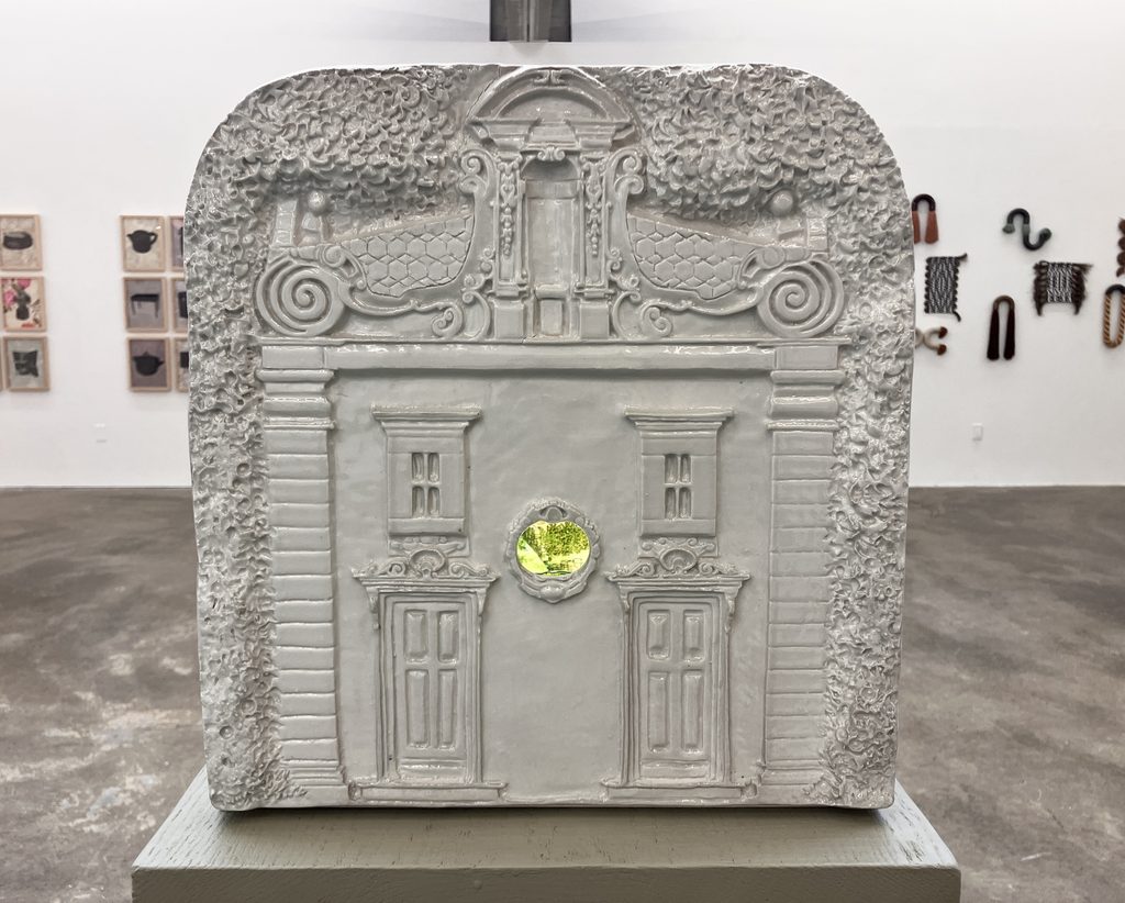
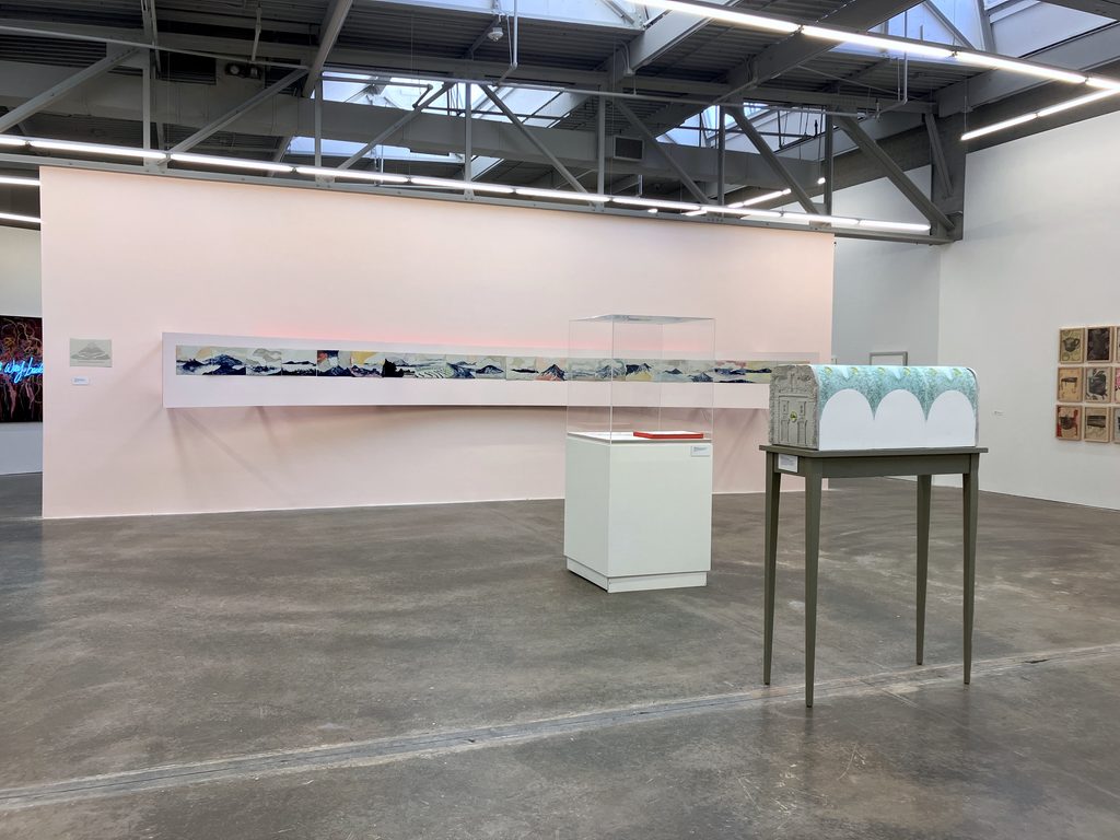
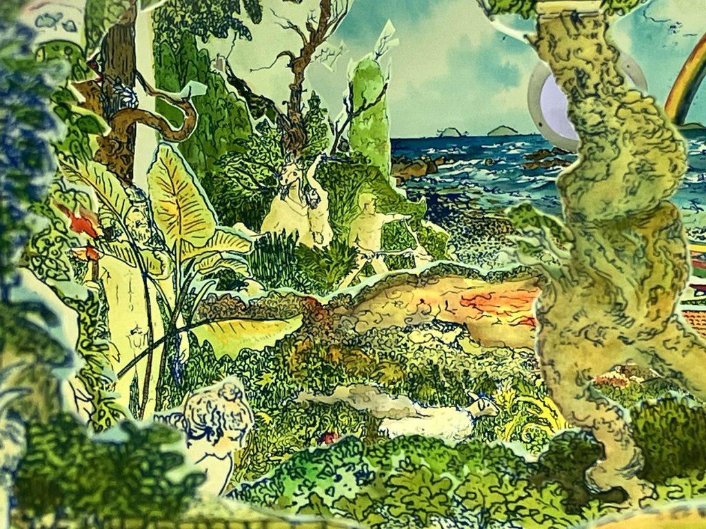
The Curtain Drawn Back: Serena Perrone’s Fata Morgana/Mondo Nuovo Multidisciplinary artist and printmaker Serena Perrone presents a double-sided peep show theater and tunnel book currently on view at the Atlanta Contemporary, weaving Tiepolo, Sicilian puppet theater and the pre-cinematic spectacle of watching while being watched into a work that mythologises and implicates in equal measure. Tiepolo’s painting Mondo Nuovo in the Ca’Rezzonico in Venice shows a crowd gathered around a diorama, each person waiting their turn to peer inside, while the painter watches them from outside the frame and places us, the viewers, in exactly the same position. We are spectator, participant, subject and character at once. Serena Perrone has been thinking about that painting for a long time, and Fata Morgana/Mondo Nuovo is the fullest expression of that thinking yet. The work is a double-sided peep show theater and tunnel book, currently on view at the Atlanta Contemporary as part of the National Museum of Women in the Arts Georgia Chapter’s exhibition 2026 Women to Watch: A Book Arts Revolution. The two sides present two contrasting narratives superimposed on the same landscape. Fata Morgana, loosely referencing Greek mythology and Arthurian lore surrounding Mount Etna, represents a place of fantasy and promised harmony, appearing and reappearing like the Aeolian Islands in changing light. Mondo Nuovo reveals the same place through a darkened lens: the hidden all-seeing eye, subplots in the periphery, a culture of excess and paranoia obscured by the beautiful chaos of natural surroundings. When two people peer in from opposing ends simultaneously, each is met by the uncanny gaze of a disembodied eye, the gaze of the other spectator, punctuating the final scene. The work draws on the history of the tunnel book, popular in the 18th and 19th centuries, in which layered scenes with cut-out centres reveal the scenes behind through an accordion bellow expansion, viewed through a small oculus on the front page. Like the magic lantern before it, the form carries a collective longing for elsewhere and the fantasy of being an unseen observer. Tiepolo knew that fantasy was false. Perrone knows it too. The hand-sculpted and cast porcelain facades are replicas she made of the oratory in her Sicilian hometown, overlooking the main square; the interior proscenium scenes are double-sided, hand-coloured screen prints. The figures are Greek statuary placed into real environments, re-enacting true stories from a recent past. “My works have begun to focus on stories embedded in and told through material culture,” Perrone says, “reaching across disciplines to permit a closer lineage between objects and their associated narratives. Placing emphasis on stories marked by instances of contradiction, mystery, and duality, my various constellations of works are unified by their recurring motifs, relying heavily on process, workmanship, and decoration.” The book arts context of the current exhibition makes a particular kind of sense for a work that uses the expanded book form as precisely that: a device for storytelling that spans and unites disciplines. Serena Perrone is a multidisciplinary artist and printmaker whose practice spans print, sculpture and the decorative arts. She received her MFA from the Rhode Island School of Design and is an Associate Professor at Georgia State University. Her work is held by the Metropolitan Museum of Art and the Whitney Museum of American Art. She is the founder and director of Officina Stamperia del Notaio, an international multidisciplinary artists’ residency in Sicily, and is represented by Cade Tompkins Projects. serenaperrone.com @serena_perrone Fata Morgana/Mondo Nuovo. Double-sided peep show theater and tunnel book. Hand-sculpted and cast porcelain, hand-coloured screen prints. Installation views, the Atlanta Contemporary, February 2026. Images courtesy the artist. https://peopleofprint.com/printmaking/the-curtain-drawn-back-serena-perrones-fata-morgana-mondo-nuovo/

PeopleOfPrint (Unofficial)
PeopleOfPrint (Unofficial) 14d

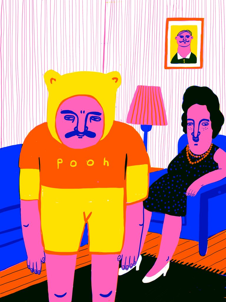
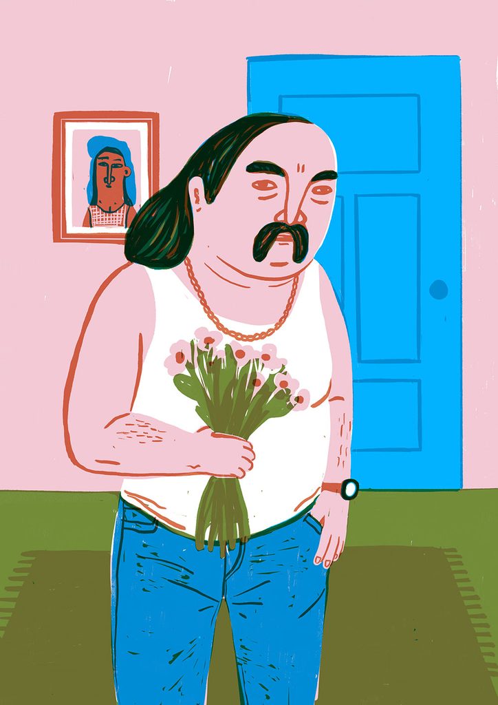
The Dog Is Just Standing There: Sarah Wouters’s Normal People Belgian illustrator Sarah Wouters prints a series of screenprints that strikes a rare balance between heartbreaking and hilarious, finding in the completely specific absurdity of everyday life something that feels uncomfortably universal. The scene is complete. A big pink man has somehow got himself into a tiny yellow paddling pool in a back garden. His wife is watching from the window of a blue shed. The dog is just standing there, taking it all in. Sarah Wouters has captured something universal. Normal People is a series of six screenprints, each 50 by 70cm, and it does what Wouters does best: takes the completely specific absurdity of domestic and everyday life and renders it with the visual confidence of someone who has spent decades noticing exactly the wrong, perfect detail. Poolboy is joined by prints including a Pooh, a Romeo, a Swan Lake and a Surfin’ Bird, each one staging a scenario that sits somewhere between heartbreaking and hilarious. “There is always someone or something in any scene who has absolutely no idea what to do,” she says. “I find those people, and those animals, very relatable.” The humour is always in the arrangement: who is watching, who is oblivious, and what everyone else is choosing not to say. Wouters has been illustrating since she first picked up a pencil in her hometown of Halle in Belgium, accumulating over twenty years of work across magazine covers, children’s fashion, CD covers, advertising and more. Her digital practice has expanded into screenprinting, linocut and ceramics, with the move into print giving her absurdist sensibility a physical texture it clearly suits. The scratchy, layered quality of the screenprint adds a layer of life to the flat unreality of the image. Sarah Wouters is a Belgian illustrator with a quirky, upside-down view of life and an obsession with all that is absurd and downright weird. Based in Belgium, her work playfully reflects the bizarre in the everyday. Website: sarahwoutersillustrator.com Instagram: @sarahwoutersillustrator / @saharawouters Normal People. Screenprints, 50 × 70cm. Series of 6. https://peopleofprint.com/screen-printing/the-dog-is-just-standing-there-sarah-wouterss-normal-people/

Welcome to PeopleOfPrint (Unofficial) spacestr profile!

About Me

Printmaking, letterpress, book arts, and glorious ink stains. Automated RSS; source content belongs to its owners. Unofficial fan feed; not affiliated with source publishers.

Interests

  • No interests listed.

Videos

Music

My store is coming soon!

Friends